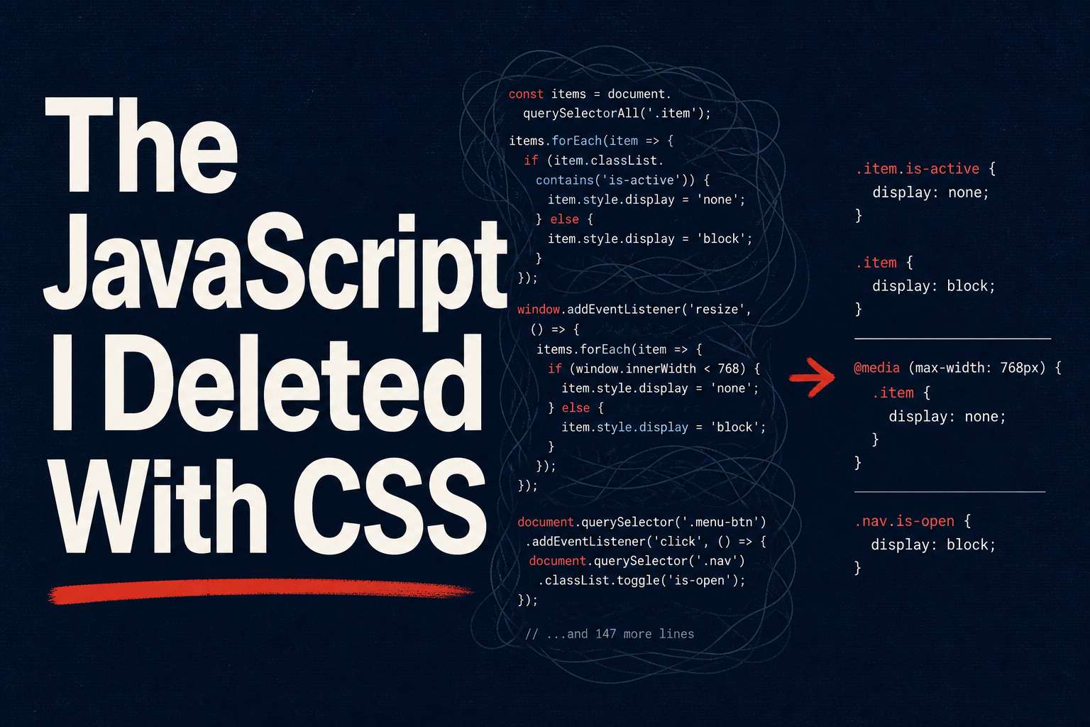
I deleted 150 lines of JavaScript from a tooltip component last week. The replacement was four lines of CSS. No virtual DOM reconciliation, no requestAnimationFrame loop, no ResizeObserver to handle container changes, no scroll listener for collision detection. The browser does all of it now, natively, on the compositor thread, faster than any framework’s JS ever did. The diff went into the PR with a one-line comment: “CSS does this.”
We’ve spent a decade shipping entire libraries for things the platform handles on its own. Popper.js and Floating UI calculate positions for tooltips and menus. Custom <select> rebuilds clock in at 200+ lines of Vue or React to get past the styling wall. IntersectionObserver patterns, scroll-progress bars, parent-state class toggles, entry animations on popovers — every one of these is a hand-rolled JS solution to a problem CSS now owns. CSS in 2026 is state-aware, layout-smart, and positioning-native. If you’re still writing getBoundingClientRect in 2026, you’re doing it the hard way. This post is the list of things I ripped out of my codebase this year and the native replacements I swapped in.
The Tooltip Library You Don’t Need Anymore — CSS Anchor Positioning
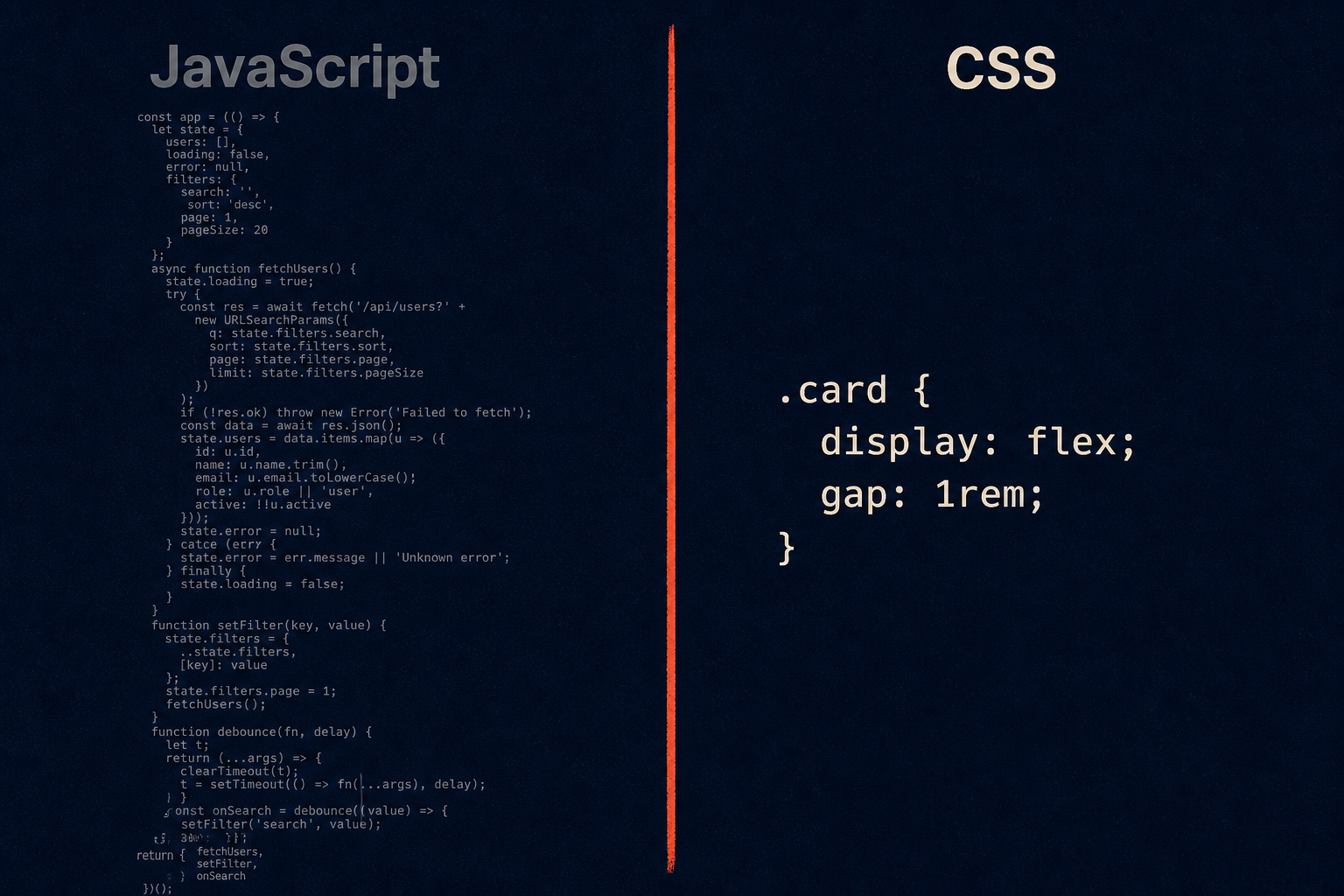
For years, positioning a tooltip, popover, or dropdown menu relative to a trigger element meant reaching for Popper.js or its successor Floating UI. These libraries are well-built — I’ve shipped them on dozens of projects — but underneath they’re doing work the browser should do for you: measuring the trigger with getBoundingClientRect, computing the floating element’s position, running collision detection against the viewport, applying a flip or shift, and re-running the whole dance on every scroll, resize, and layout change. The bundle cost is real: Popper adds roughly 5 KB minified and gzipped just to position a bubble of text.
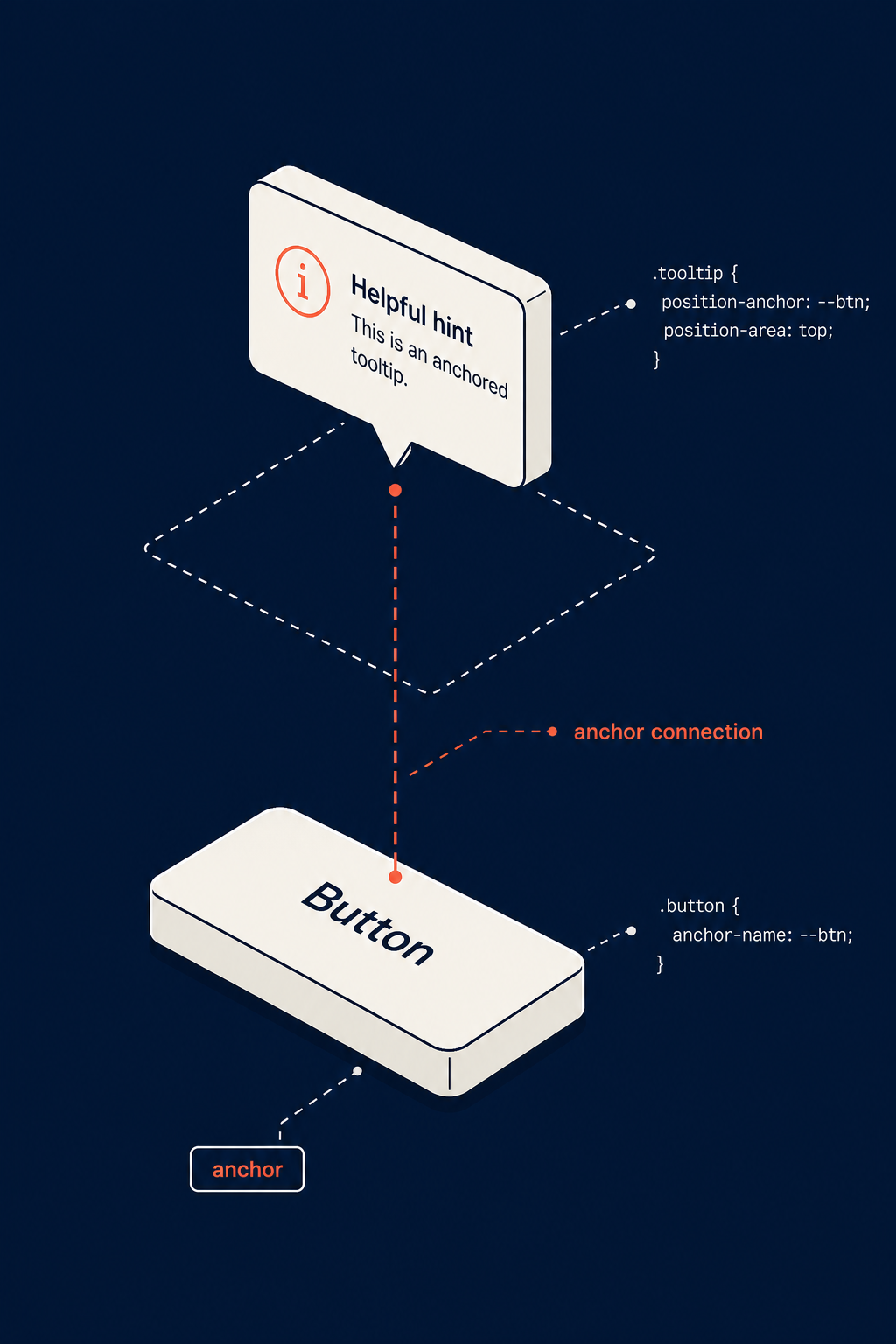
The CSS Anchor Positioning API makes all of that unnecessary. As of early 2026 it’s supported across every major browser: Chrome 125+, Edge 125+, Safari 26+, and Firefox 147+. You name an element as an anchor, then point a positioned element at that anchor and describe where it should sit. The browser handles the geometry, the reflow, and — with one declaration — the collision detection.
Here’s the old JS approach, abbreviated to the shape of it:
| |
And here’s the new CSS approach:
| |
That’s it. The anchor-name property registers the trigger as an anchor. The position-anchor property on the tooltip ties it back. The anchor() function reads geometric values from the anchor — anchor(top), anchor(right), anchor(center) — and justify-self: anchor-center handles horizontal centering. No measuring, no math.
The line doing the heavy lifting is position-try-fallbacks: flip-block. This is the CSS-native equivalent of Popper’s flip modifier. When the tooltip would overflow the top of the viewport, the browser automatically tries the fallback strategies you list and picks the first one that fits. flip-block mirrors it to the other side on the block axis; you can also list flip-inline, shift-inline, or a named @position-try rule for custom fallback sets. (You’ll see older articles call this position-try-options — it was renamed to position-try-fallbacks during the spec stabilization. Same idea, current name.)
Two more capabilities worth knowing. First, anchor-size() lets you size the floating element from the anchor — width: anchor-size(width) makes a dropdown menu match the trigger button’s width, a pattern I’ve typed out by hand a hundred times. Second, anchor positioning composes cleanly with popover and <dialog>, both of which live in the top layer. You get a popover that escapes overflow clipping and still tracks its trigger without a single line of positioning JS.
Customizable Native Selects Without 150 Lines of JavaScript
Every frontend developer has fought the <select> element and lost. Native selects were designed before styling was a priority. The closed box barely takes color and background. The open dropdown list — the picker — was completely off-limits, rendered by the OS. Your options were to live with the default look or build a custom dropdown from scratch. The custom dropdown route is the one most teams pick, and it is a trap. A correct dropdown needs keyboard navigation (Arrow keys, Enter, Escape, type-ahead), focus management, ARIA roles, overflow handling, outside-click dismissal, and careful edge-case handling for long lists and small viewports. I have reviewed 200-line Vue components that reimplement all of this and still ship bugs.
The platform fix is appearance: base-select (Chrome 135+) paired with the ::picker(select) pseudo-element. base-select opts the element into a fully styleable rendering mode where the browser still owns all the behavior. ::picker(select) targets the open list itself.
| |
| |
What the browser still handles for free, even in base-select mode: overflow management when the list is longer than the viewport, anchor positioning fallback so the list flips above the trigger when there’s no room below, full focus management, complete keyboard navigation, and — critically — progressive enhancement. Browsers that don’t understand appearance: base-select simply ignore it and render a normal native select. You don’t ship a broken component to older browsers; you ship a less fancy one.
This is the part that matters to me as someone who has maintained custom dropdown code. Every bug in that dropdown list — the focus-trap that captured the wrong tab order, the Escape handler that broke when the menu was already closed, the long-list that clipped under a sticky footer — is now the browser team’s problem, not mine. The CSS above gives me the styling I wanted, and the behavioral correctness comes for free.
Kill Your Scroll Listeners — Scroll-Driven Animations
The scroll-driven animation pattern is one of the most common JS patterns in the wild, and one of the most commonly implemented badly. The classic shape is a scroll event listener that runs requestAnimationFrame, reads window.scrollY, computes a progress ratio, and mutates a style property on an element. Done correctly with passive listeners and rAF coalescing it’s acceptable. Done naively — a direct style write inside the scroll handler — it janks the whole page because every scroll event fires dozens of times per second and blocks the main thread.
CSS scroll-driven animations replace all of it. You bind an animation to a scroll timeline and the browser drives it on the compositor thread, off the main thread entirely. No listeners, no rAF, no manual ratio math, no reflow.
A scroll progress bar at the top of the page, the canonical example:
| |
The animation is defined as a normal @keyframes. The animation-timeline: scroll(root) declaration binds the animation’s progress to the scroll position of the root scroller — when you’re at the top, the animation is at 0%; when you’re at the bottom, it’s at 100%. scroll(root) means the page scroll container; you can pass scroll(nearest) or a named scroll container too.
The other timeline is view(), which animates an element based on its own position relative to the scroller as it enters and exits the viewport. This is the IntersectionObserver fade-in pattern, but declarative and main-thread-free:
| |
animation-range: entry 0% to entry 100% means the animation runs across the range where the element is entering the viewport. When the element first peeks into view it’s at from (opacity 0, translated down); when it’s fully entered it’s at to (opacity 1, in place). You also get exit, contain, and cover ranges, plus the ability to scope animations to horizontal scroll and to specific sub-ranges inside each phase.
The performance difference is the real argument. These animations run on the compositor thread. A heavy JS scroll handler will fight your React renders and your image decoders for main-thread time and visibly stutter. The compositor-driven version doesn’t touch the main thread at all. On low-end Android devices and on busy dashboards the difference is immediately visible.
State-Aware CSS: :has() and @starting-style
Two features land here that collapse common JS patterns into declarations: :has() for relational state and @starting-style for entry animations.
:has() is the parent selector developers asked for since roughly 2005. It hit Baseline in 2023 and is universally supported by 2026. Before :has(), if hovering a child needed to change the parent, you’d write JS to toggle a class on the parent on mouseenter and remove it on mouseleave. Now it’s one rule:
| |
The validation example is the one I keep reaching for. A .form-group:has(input:invalid) rule shows the error message whenever the input is invalid, with no validator hook, no class toggling, no watch in Vue, no useEffect in React. The browser already knows whether the input is valid; :has() just lets CSS read that state and act on it at the parent level. The theme-toggle example is equally clean — a checkbox state in the DOM drives the entire page’s color scheme through one CSS rule.
@starting-style solves the other long-standing CSS gap: you could not animate an element’s appearance when it entered the DOM or switched from display: none to display: block. The transition had no “before” state to transition from, so the element just popped in. @starting-style gives you that before state:
| |
When the dialog first appears, it starts at opacity: 0 and scale(0.9) and transitions to the resting state over 0.3 seconds. This is the entry-animation pattern that previously required either a JS-driven requestAnimationFrame flush or a CSS-class toggle hack (requestAnimationFrame(() => el.classList.add('is-open'))). With @starting-style and the popover and dialog attributes — both top-layer — you get fully native modal entry and exit animations with the transition-behavior: allow-discrete property handling the display swap itself.
Data-Driven Styling: Typed attr() and sibling-index()
These two are the newest and least-supported of the set, but they point at where styling is going: pushing more data directly from HTML into CSS without a JS class-shim layer in between.
attr() used to be nearly useless — it only worked on the content property for generated text. The typed attr() extension lets you read typed values from attributes: colors, lengths, numbers, with a fallback for when the attribute is missing.
| |
Set data-color="#e34c26" on the element and the badge gets that background. Previously this needed either an inline style or a JS loop over the elements setting a CSS custom property each. The typed attr() makes HTML data attributes first-class styling inputs.
sibling-index() and sibling-count() are functions that return, respectively, an element’s position among its siblings and the total sibling count. The classic use is staggered animation delays without hardcoding or generating classes:
| |
The first rule gives each carousel item a delay proportional to its position — item 0 has no delay, item 1 has 0.1s, item 2 has 0.2s. No :nth-child(1), :nth-child(2) boilerplate, no generating inline styles from a template loop. The second rule uses sibling-count() to make flex sizing self-adjusting: three nav items each get flex: 0.333, four each get 0.25, all without knowing the count ahead of time.
Both of these are experimental as of mid-2026 — typed attr() is in Chrome 135+ and nowhere else yet, sibling-index() is even further out. I’m including them because they’re the next wave, not something to ship today.
Browser Support Reality Check — What to Use Today vs. Wait On
Here’s where everything actually stands in mid-2026. I keep this table pinned because the gap between “the spec exists” and “I can ship this without a fallback” is the whole game.
| Feature | Chrome | Firefox | Safari | Status | Safe for Production? |
|---|---|---|---|---|---|
| Anchor Positioning | 125+ | 147+ | 26+ | All major browsers | Yes (early 2026) |
:has() | 105+ | 121+ | 15.4+ | Baseline 2023 | Yes |
| Scroll-driven animations | 115+ | Not yet (behind flag) | 26+ | Partial | Feature-detect first |
appearance: base-select | 135+ | Not yet | Not yet | Chrome only | Progressive enhancement only |
@starting-style | 117+ | 129+ | 17.5+ | Baseline | Yes |
Typed attr() | 135+ | Not yet | Not yet | Experimental | No — wait |

The pattern that works across all of these is progressive enhancement behind @supports. You declare a functional baseline that works everywhere, then layer the native enhancement on top for browsers that support it:
| |
This is the strategy I use for every feature in the table except typed attr(), which is too early and too Chrome-only to bother guarding yet. The anchor positioning, base-select, and scroll-driven-animations rules all sit behind @supports checks; browsers that fail the check get the fallback styling, browsers that pass get the enhanced version. The cost is a few extra rules. The payoff is no runtime feature-detection JS and graceful behavior on every browser.
Two practical notes on the table. Scroll-driven animations are the most awkward because Firefox lags — if your audience skews Firefox-heavy, feature-detect with @supports (animation-timeline: scroll()) and keep the JS fallback for that slice. And appearance: base-select is Chrome-only for now, which sounds bad but is fine in practice because the failure mode is a normal native select. You ship it, Chrome users get the styled version, everyone else gets a working unstyled select, nobody gets a broken page.
What You Should Do Monday Morning
This is the practical list. None of it requires a rewrite.
Audit your bundle for Popper.js and Floating UI. Search your
node_modulesand your bundle analysis output. For each usage, check whether CSS anchor positioning covers the case — tooltips, simple menus, popover-positioned elements almost always do. Complex floating UI with custom middleware is the one place you’ll keep the library. Everything else is a deletion candidate.Replace IntersectionObserver-based fade-ins with
animation-timeline: view(). If you have av-intersectdirective or auseInViewhook that just toggles a class to trigger a CSS transition, the nativeview()timeline replaces it entirely. Guard with@supportsand keep the JS for browsers without support.Audit your
:has()-equivalent JS patterns. Anywhere you’re toggling a class on a parent based on a child’s state — hover, focus, invalid, checked — is now a:has()rule. The theme-toggle, the form-validation reveal, the hover-card parent highlight. These are small, safe wins.Don’t rip out working code. Add
@supportsguards around the new CSS and migrate incrementally. A tooltip that already works in production is not a fire to put out. Ship the native version on new components, and migrate the old ones when you’re already in the file for another reason. A big-bang rewrite is how you introduce regressions.Track support on caniuse.com and web.dev/status. The Baseline definitions move quarterly. Firefox shipping anchor positioning in 147 was the milestone that turned it from “progressive enhancement” to “ship it” — those thresholds arrive on a schedule, and you want to be ready to delete your fallback the day they cross.
The throughline across all of this: the browser got good. The libraries we shipped for a decade were filling real gaps, and the CSS working group closed those gaps. Popper.js was the right tool in 2019. Floating UI was the right tool in 2022. In 2026, for the majority of positioning work, they’re dead weight in your bundle. The same is true of custom dropdowns, scroll listeners, class-toggle state management, and IntersectionObserver fade-ins. Each one has a native replacement that is smaller, faster, and more correct than the JS it replaces.
The satisfying part isn’t just the bundle size. It’s that the platform is converging on a model where HTML describes structure, CSS describes appearance and behavior, and JavaScript describes the actual application logic — not the plumbing around it. Every line of positioning JS I deleted this year was a line that wasn’t doing anything only JavaScript could do. The CSS replaced it, and the JS went back to doing what JS is actually for.
Further Reading
- CSS Anchor Positioning API — the Chrome team’s introduction, still the clearest reference for
anchor(),position-try-fallbacks, and the@position-tryrule. - CSS in 2026 (LogRocket) — a broader survey of what landed this year, including the features I skipped here (container queries maturity, text-wrap balance, field-sizing).
- Scroll-Driven Animations (Josh Comeau) — the best walkthrough of
view()timelines andanimation-rangeI’ve read, with interactive demos that make the ranges click.