This morning I opened my blog and thought: this looks like a 2015 Tistory template. So I told my Hermes agent, in exactly these words: “This looks like garbage. Go through all 54 design systems and rebuild it with the best one.”
It did.
Why Linear.app Won Out of 54
The popular-web-designs skill in Hermes has templates for 54 real-world design systems — Stripe, Linear, Vercel, Notion, Figma, and 49 others. The agent loaded them all and surfaced five recommendations:
| System | Strengths | Fit |
|---|---|---|
| Linear.app | Dark-mode-native, 3-tier weight system, indigo accent | ★★★★★ |
| Vercel | Black & white precision, Geist font | ★★★★ |
| Stripe | Signature purple gradients, marketing polish | ★★★ |
| Sanity | Red accent, editorial-first layout | ★★★ |
| Framer | Bold + motion-forward | ★★ |
Linear won for one reason: it’s the reference implementation for an IT/developer blog. Dark mode by default. No fluff. Three font weights that make code blocks and technical prose feel like they belong together. The indigo accent (#5e6ad2) is restrained enough to disappear when you’re reading and present enough to guide your eye when you’re scanning.
Extracting the DNA: Design Tokens Into Hugo CSS
Linear’s system boils down to a handful of principles:
| |
I ported these into Hugo’s assets/css/tokens.css, then rewrote theme.css, article.css, featured.css, and interactions.css to follow Linear’s rules. 811 lines added, 706 removed.
The trickiest part was keeping Zemna’s brand identity intact while adopting Linear’s structure:
| Element | Zemna Brand | Linear DNA (adopted) |
|---|---|---|
| Primary | Navy #1A2238 | Indigo #5e6ad2 (accent only) |
| Accent | Vermilion #E34234 | Preserved (Zernio brand consistency) |
| Background | — | #08090a (Linear’s marketing black) |
| Font | D2Coding | Inter Variable + cv01/ss03 |
The rule: Linear’s skeleton, Zemna’s colors. Indigo stays in CTAs and highlights. Vermilion keeps the Zernio connection alive. Nothing clashes.
Swapping AI Models Mid-Task (Unplanned Experiment)
This turned into an accidental model comparison. Three different models worked on the same codebase:
| Model | Provider | What It Excelled At |
|---|---|---|
| MiniMax-M3 | — | Initial passes. Design intuition is there, but detail drift piles up. |
| GLM-5.1 | OpenCode Go | Structural thinking. Templates, template logic, bug fixes. Fast and accurate. |
| GPT-5.5 | OpenAI Codex | Full audit + polish. Logo design, SEO metadata, link checking, the final 10%. |
Takeaway: one model end-to-end is worse than a pipeline. GLM for architecture, MiniMax for drafts, GPT for finishing. Treat them like a human team and the output is better than any single model’s best.
What Changed in One Afternoon
| |
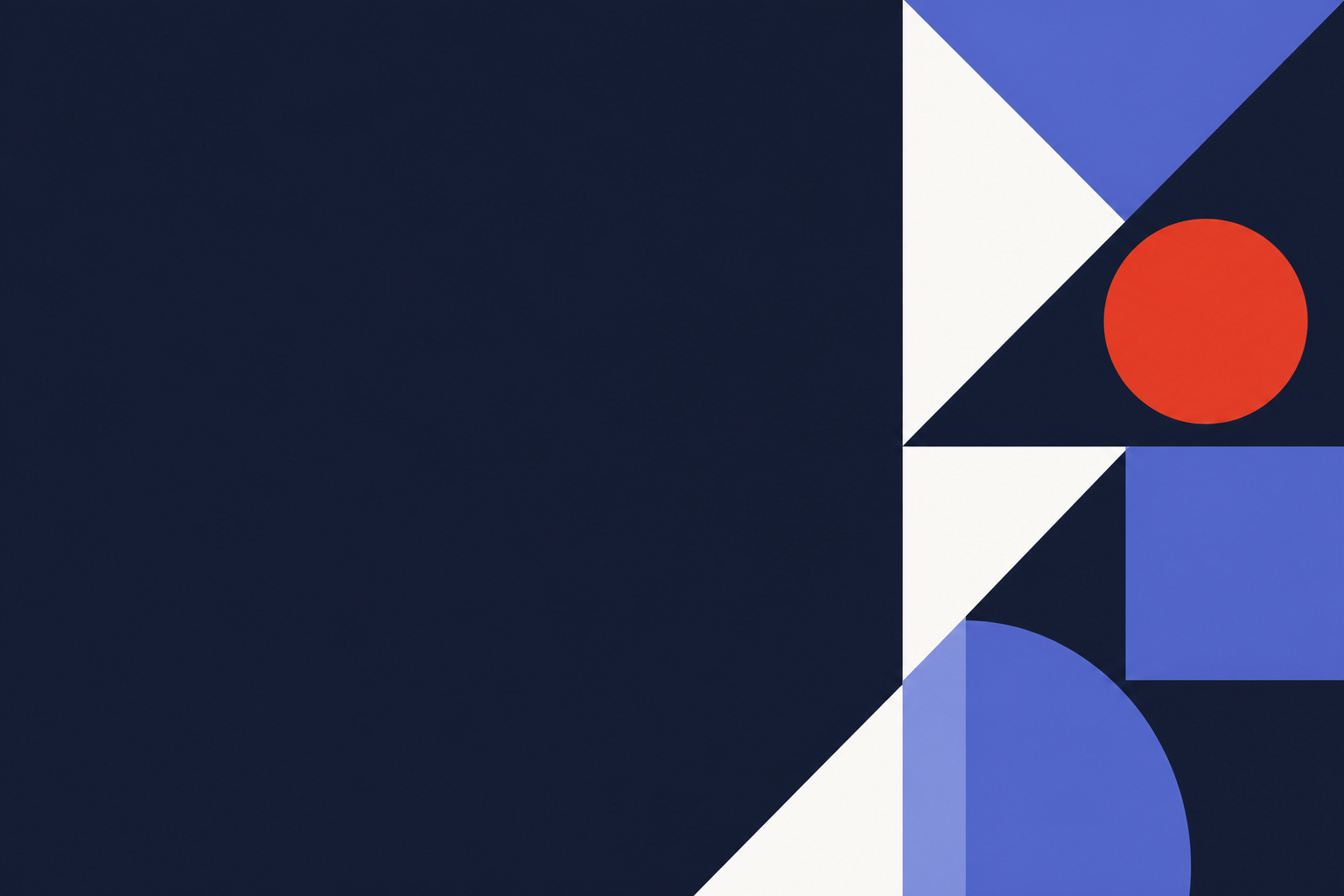
Three Git commits. 21 files changed. 1,500+ lines of CSS rewritten. One cover image generated (Jakarta skyline at golden hour, Bauhaus-inspired geometric abstract).
What I Learned
Choosing from 54 is faster than choosing from 3. More options force clearer criteria. You stop asking “which one looks nice” and start asking “which one was built for my exact use case.”
AI agents respond better to blunt feedback. “This looks like garbage” produced a better result than “let’s improve the design.” Sugarcoating wastes tokens.
Static sites can have real design systems. Hugo + CSS custom properties is enough. You don’t need a React component library or a design tool. Design tokens in
:rootget you 90% of the way.Models have specialties — use them. GLM for structure, GPT for polish. A multi-model pipeline beats any single model. This isn’t a hot take; I literally watched it happen on my own codebase this afternoon.
Live site: zemna.net
Post URL: zemna.net/posts/linear-design-system-hugo/
GitHub: github.com/zemna/zemna.net